- UX/UI
- CRO
- Design
- Development
- Consultancy
The challenge
Peter Jackson the Jeweller had a legacy Magento 1 site that wasn’t performing as it should. The user experience didn’t come close to what customers received in store.
Our challenge was to develop a solution that was lightning fast and would give the best experience possible on ALL devices. This was supported by a multi-channel digital marketing strategy to enable Peter Jackson the Jeweller to compete at a national and international scale.
User experience analysis
While considering user testing and analytical data, it was important to establish the varied types of customer groups we were analysing and identify what stage they had reached in their purchase journey. Here we identified three key audience groups. These were: price conscious gift buyers, watch enthusiasts, and collectors.
As with every new project, we wanted to establish what already worked and what could be improved on the site. Positives included Peter Jackson the Jeweller’s fantastic product range, the efficient customer service (via web chat), and the array of USPs that every online purchaser looks for while shopping. A few key issues we discovered are highlighted below.
01 Painfully slow loading
Speed is one of the crucial pain points for the majority of users and causes many site abandonments. The Peter Jackson the Jeweller website was very slow – taking an average of eight seconds to load. User testing showed how pages failed to load instantly, feeling laggy and causing user frustration. This was very concerning for us and, therefore, informed the web build from the start of the project.
02 Poor wayfinding & filtering
One of the key findings that we quickly established was that the wayfinding experience was not the easiest. It was clear that work was needed to help users understand the products on offer earlier, direct them to the right categories, and provide easy-to-use filtering options to keep them browsing for longer.
UX summary
Our analysis informed the new website development planning and design – from users first landing, to hitting the buy button at the end with confidence. We considered key USPs that users need to help them make an informed choice, while offering clever filtering methods along the way for users who know exactly what they want.
The solution
We required a solution that provided a robust back office, with an exceptionally quick front-end customer experience. As Magento developers and Vue Storefront partners, we were confident the combined capabilities were the perfect answer.
Vue Storefront is a standalone progressive web app (PWA) storefront for ecommerce, which is able to connect with any ecommerce backend (e.g. Magento, PrestaShop or Shopware) through an API. Its key features include:

Ultrafast
loading
Renders in milliseconds, which increases engagement, improves conversion and lowers bounce rates.
Supports all
devices
100% responsive and smooth shopping experience, without apps needing to be developed for different platforms like iOS and Android.
Native
functionality
App-like user experience. Takes advantage of push notifications, home screen access, and full-screen mode.
Offline shopping
capabilities
Store works in offline mode, allowing users to browse products with poor, or no, internet connection on any device.
Fast, fresh and fantastic!
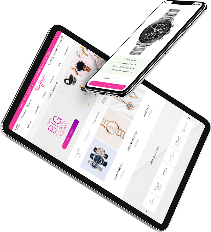
Let us introduce you to the new Peter Jackson the Jeweller website. It not only looks great, it’s super fast too and is armed ready to convert.

Website features
Considering functionality and UX findings from earlier, here are some features we added in to make the product-finding process more user friendly and give a customer service experience that people would expect in store.
01 Showcasing brand pages
By providing a tailored brand experience for Peter Jackson the Jeweller, users can easily browse the latest collections, delve deeper into featured categories, and filter products to their specific budgeted amounts.
This online, but store, feel is a perfect way to showcase Peter Jackson the Jeweller’s brand loyalty, while assuring customers that they can buy in confidence with an exceptional array of USPs.
02 Sort / filtering options
With the latest addition of infinite scroll, users can browse categories easily and even add additional filter options should they need to. As a result, the experience of browsing for the perfect gift feels effortless.
The addition of USPs, which capture a user's eye, also give an extra sense of security that there won't be any hidden costs at the end of the user experience.
The result
Peter Jackson the Jeweller now has a future-friendly sales platform to match the business’s online growth ambitions. The technical build ensures users receive an experience that is matched in store. Early sales figures are positive, with holiday season campaigns ready to launch.
increase in revenue
increase in transactions
indexed page increase
Through dynamite's strategic planning and wealth of knowledge, we launched a new site that we are very proud of. We look forward to continuing to develop with the agency for many years to come.
Danny Bond, Ecommerce Manager, Peter Jackson